Teejay Interior
A luxury interior design landing page — built purely for the love of craft
View LiveOverview
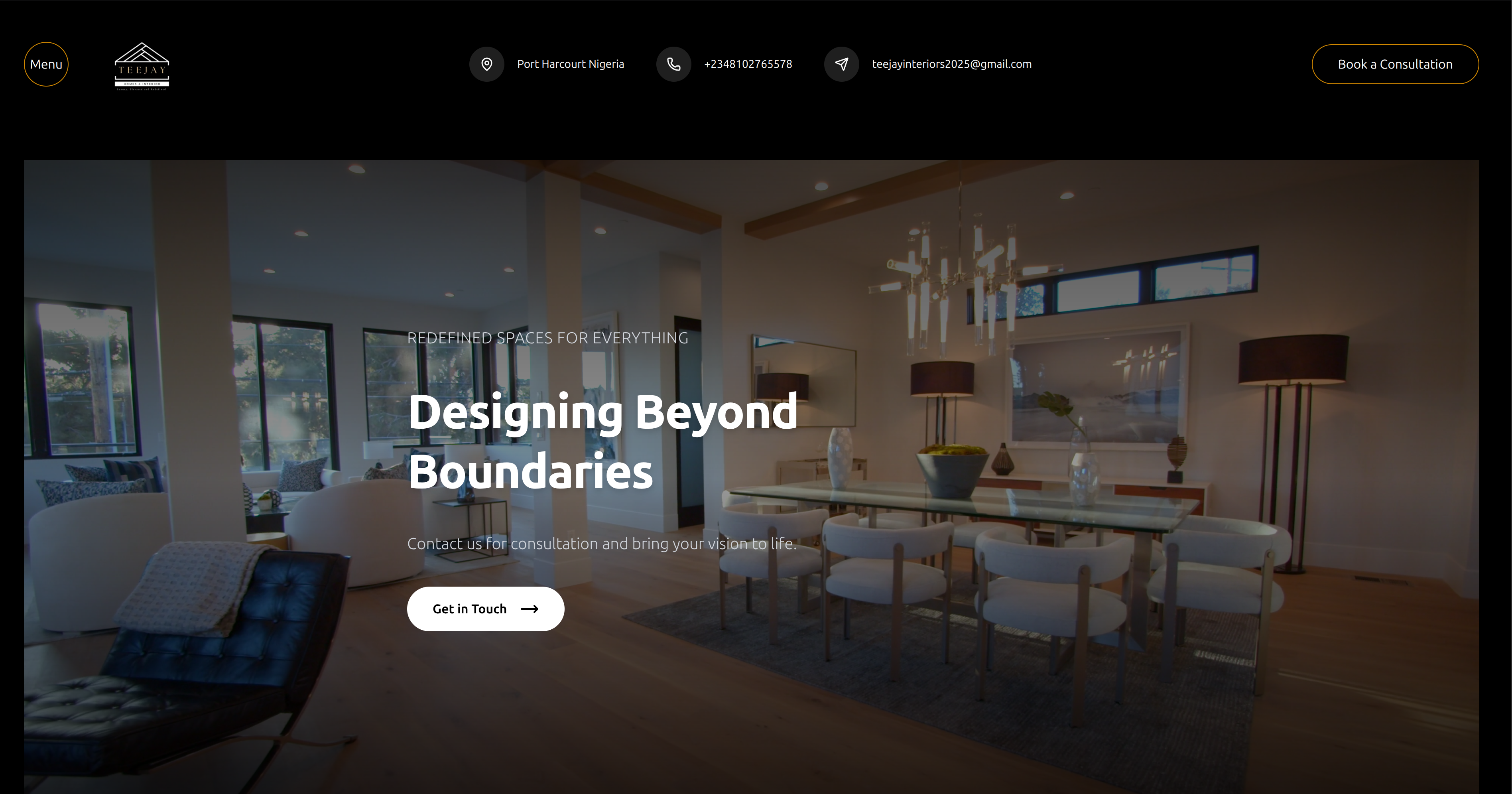
Teejay Interior is a luxury interior design landing page designed and built from scratch as a personal creative project. No templates, no UI libraries — every section, transition, and spacing decision was intentional. The goal was to produce something that felt closer to editorial design than a typical web project, while keeping the code clean and the performance sharp.
The Inspiration
This one had no brief, no client, no deadline. Just me wanting to see how good a landing page could look when there was nothing stopping me from going all the way. Interior design as a domain felt like the right canvas — rich imagery, deliberate white space, the kind of visual hierarchy that rewards attention. I built it purely for fun, and honestly it reminded me why I got into this in the first place.
Tech Stack
Next.js 14
Even for a static landing page, Next.js gives clean routing, image optimisation out of the box, and a deployment story that takes seconds. No reason to reach for anything heavier.
TypeScript
Habit at this point — even on fun projects. Typed component props and data structures mean fewer surprises when you come back to the code a week later.
Tailwind CSS v4
The CSS variable-based token system in v4 made it easy to maintain a consistent visual language — the warm neutrals, the spacing rhythm, the typography scale — without writing a single custom CSS file.
Framer Motion
Smooth entrance animations and scroll-triggered reveals were central to the luxury feel. Framer Motion let me add those without wrestling with keyframes or Intersection Observers by hand.
Challenges & Solutions
Getting the hero section to feel genuinely premium — not just "big image, some text" — without overcomplicating the layout or bloating the page weight.
Used a full-bleed image with a carefully tuned gradient overlay, set the heading in a large display weight with tight letter-spacing, and let generous white space do the heavy lifting. The restraint was harder than the code.
Scroll-triggered animations that felt smooth and intentional rather than gimmicky — the common failure mode for landing pages that try to be visually rich.
Kept animations to simple opacity and translateY transitions with staggered delays. The rule was: if removing the animation makes the page feel flat, keep it. If it just draws attention to itself, cut it.
What I Learned
- 01
Building something with zero constraints is one of the best ways to sharpen your design instincts — you have to make every decision yourself, which means you have to actually justify it.
- 02
Luxury in web design is almost entirely about restraint: fewer elements, more space, slower transitions, less colour. The temptation to add more is always wrong.
- 03
Tailwind v4's design token system genuinely shines on design-led projects where visual consistency matters more than component reuse.
- 04
Fun projects are where you take the risks you won't take on production codebases — and that's where you actually learn the most.